…fast and lightweight (3KB) javascript utility that detects browser and pixel ratio, allowing you to serve conditional JavaScript and CSS files. Rebuilt from it’s jQuery predecessor, it’s now 50% faster.
Archive: February 2013
Native views and web views are good at different things.
Native is good for high fidelity interaction, animations, responding to gestures. However the native APIs are bad for designing “documents” — that is, layouts where elements flow within a container and push each other around. That means that things that are extremely easy on the web can be painstaking in native UI without much upside.
Web views have limited interactivity, but they have other advantages:
* Faster iterations. You don’t need to push a build when a webview changes.
* Document-style layout, as mentioned above.
* Higher density. We found it easier to show more information on the screen with HTML/CSS than the native controls. Looking at other apps out there makes me think it’s an attribute of the medium, not just us.
* No need to sync data or duplicate logic. Sending HTML down the pipe is simple.
Finally yes, we get the multi-platform advantages because the web views are also served to people who hit the regular mobile web version of the app without any wrapper.
Via @keff85
Nice overview by Harry Roberts.
Via @sixrevisions
If you are in the business of building anything for users, you must watch this. For those of you who know her “Creating the passionate users” talk, this is an updated version of the theme.
Via @paveldolezal & @davegreiner
Not long ago, designers were eclectic generalists. They studied art, science, and religion in order to understand the basic workings of nature, and then applied what they learned to solve the problems of the day. Over time, the quantity and complexity of accumulated knowledge led to increased specialization among designers, and breadth of knowledge was increasingly traded for depth of knowledge. This trend continues today. As designers become more specialized, awareness of advances and discoveries in other areas of specialization diminishes. This is inevitable and unfortunate, since much can be learned from progress in other design disciplines.
Score: ★ ★ ★ ★ ☆
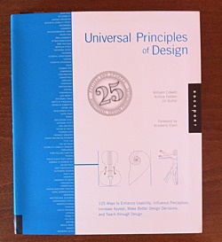
This paragraph — from the brief introduction of the book — tells you much about its content.
It picks and describes 125 universal principles of design. Each on two pages. First page concisely summarizes the principle giving you resources for further reading. The second page holds real-world example of the principle.
Principles are ordered alphabetically. Here is the first ten to give you some feel:
- 80/20 rule
- Accessibility
- Advance Organizer
- Aesthetic-Usability Effect
- Affordance
- Alignment
- Anthropomorphic Form
- Archetypes
- Area alignment
- Attractiveness Bias
In my view Universal Principles of Design accomplishes what the authors set out to do:
Courses in psychology and anthropology were glaringly absent from my undergraduate and graduate design education. Indeed, a deeper understanding of human behavior and a scholarly approach to design were almost entirely overlooked. I left college with considerable knowledge in form making and very little knowledge in understanding human perception and meaning making. Universal Principles of Designis a resource that helps to fill in some of the gaps, dispel myths, and give sound reasons for much of what is felt intuitively, and yet not fully understood.
What I like the most about this book is its mix of conciseness and comprehensiveness. Like a good map, it gives you clear overview of wast area while giving you pointers where to delve deeper.
Warning: Should you buy this book after clicking on the links at this page, I may get some coffee money from Amazon.