Ajax Autocomplete for jQuery allows you to easily create autocomplete/autosuggest boxes for text input fields.
Category: User Interface
The trend away from skeuomorphic special effects in UI design is the beginning of the retina-resolution design era. Our designs no longer need to accommodate for crude pixels. Glossy/glassy surfaces, heavy-handed transparency, glaring drop shadows, embossed text, textured material surfaces — these hallmarks of modern UI graphic design style are (almost) never used in good print graphic design. They’re unnecessary in print, and, the higher the quality of the output and more heavy-handed the effect, the sillier such techniques look. They’re the aesthetic equivalent of screen-optimized typefaces like Lucida Grande and Verdana. They work on sub-retina displays because sub-retina displays are so crude. On retina displays, as with high quality print output, these techniques are revealed for what they truly are: an assortment of parlor tricks that fool our eyes into thinking we see something that looks good on a display that is technically incapable of rendering graphic design that truly looks good.
…
If you want to see the future of software UI design, look to the history of print design.
I mostly agree, but I would be carefull with relying on the print for guidence to future software UI designs. For one thing, print is not interactive, neither is used to get the job done in the same way software is.
I agree we are at the beginning of the swing in the opposite direction from skeuomorphism and I think we will overdo it, as we always do.
The evolution of design is sort of tacking against the wind.
Another example of what I call primary research in HTML5, CSS & JavaScript:
FFF is a collection of interactive experiences. Each experience has its own unique design and functionality. All the experiences are created in HTML5, the site works beatifully on both desktop and tablet.
A fully responsive and lightweight jQuery dateinput picker
Via @Zraly
Nice collection of jQuery plugins with search. (Though I would prefer tags.)
Via @elfineer
Hidden features, reduced discoverability, cognitive overhead from dual environments, and reduced power from a single-window UI and low information density. Too bad.
 Some good thinking done by Chris Norström. Solves the confusion of the classical “iPhone slider”, where you are not sure if the visible status (OFF) is the active one, or you have to switch to get to it.
Very nice stencil by good people at Viget.
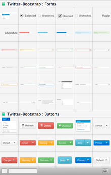
You get all the Bootstrap UI element but even better, you get all the great Glyphicons not as PNGs but as Omnigraffle shapes allowing you to resize them without losing quality and to color them or doing anything else you could do with a shape.
All in all, this is my new favourite wireframing stencil.
Quick tip: To install, just drag the stencil file to the OmniGraffle icon at the Dock. Then just press Cmd + 0 to show the Stencils panel.
Nice tutorial over at CSS-Tricks.
Brian Groudan on Mozilla UX blog:
I worked closely with Mozilla user experience researchers and designers to rethink how Firefox can better offer “save for later” in the browser.
Overview of the design process phases follows.
Nice overview how to code for high pixel density (160 PPI and up) displays.
Via @daeltar
Nice work by Kiandra team.
Jetstrap may be useful.
Via @jakubspanihel
As we are all going to do mobile first soon, these printable free templates will come in handy.
Granted, it is a preview and the real version should ship early 2013, but if it looks anything like this then Microsoft is crazy.
One comment from the guy doing the video made me laugh:
Obviously, you can see it’s not entirely optimized for a touch experience… but it is there.
Let me paraphrase that: Obviously, you will feel like throwing the thing against the wall in 5 seconds, but for some perverted reason it is there.
That’s what a disrupted company does.
Via @satai
List of 20 well articulated points by Joshua Porter.
Intel made wise decision when they hired Luke Wroblewski to do this video series about new interactions and how to use them in your apps.
Via @BerkaUX
