Native views and web views are good at different things.
Native is good for high fidelity interaction, animations, responding to gestures. However the native APIs are bad for designing “documents” — that is, layouts where elements flow within a container and push each other around. That means that things that are extremely easy on the web can be painstaking in native UI without much upside.
Web views have limited interactivity, but they have other advantages:
* Faster iterations. You don’t need to push a build when a webview changes.
* Document-style layout, as mentioned above.
* Higher density. We found it easier to show more information on the screen with HTML/CSS than the native controls. Looking at other apps out there makes me think it’s an attribute of the medium, not just us.
* No need to sync data or duplicate logic. Sending HTML down the pipe is simple.
Finally yes, we get the multi-platform advantages because the web views are also served to people who hit the regular mobile web version of the app without any wrapper.
If you are in the business of building anything for users, you must watch this. For those of you who know her “Creating the passionate users” talk, this is an updated version of the theme.
Not long ago, designers were eclectic generalists. They studied art, science, and religion in order to understand the basic workings of nature, and then applied what they learned to solve the problems of the day. Over time, the quantity and complexity of accumulated knowledge led to increased specialization among designers, and breadth of knowledge was increasingly traded for depth of knowledge. This trend continues today. As designers become more specialized, awareness of advances and discoveries in other areas of specialization diminishes. This is inevitable and unfortunate, since much can be learned from progress in other design disciplines.
Score: ★ ★ ★ ★ ☆
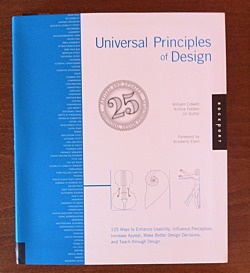
This paragraph — from the brief introduction of the book — tells you much about its content.
It picks and describes 125 universal principles of design. Each on two pages. First page concisely summarizes the principle giving you resources for further reading. The second page holds real-world example of the principle.
Principles are ordered alphabetically. Here is the first ten to give you some feel:
Courses in psychology and anthropology were glaringly absent from my undergraduate and graduate design education. Indeed, a deeper understanding of human behavior and a scholarly approach to design were almost entirely overlooked. I left college with considerable knowledge in form making and very little knowledge in understanding human perception and meaning making. Universal Principles of Design is a resource that helps to fill in some of the gaps, dispel myths, and give sound reasons for much of what is felt intuitively, and yet not fully understood.
What I like the most about this book is its mix of conciseness and comprehensiveness. Like a good map, it gives you clear overview of wast area while giving you pointers where to delve deeper.
Warning: Should you buy this book after clicking on the links at this page, I may get some coffee money from Amazon.
When Page took office, his first directive was clear. “Larry said ‘hey everyone, we’re going to redesign all of our products,’” recalls Jon Wiley, lead designer on Google Search. Wiley and co had just two months to give Google a fresh coat of paint, and to start thinking holistically about how Google as a whole was perceived. “We had a mandate to make this all look good,” Wiley says.
I would just add that, as Steve Jobs said:
Design is not just what it looks like and feels like. Design is how it works.
And there is a lot of emphasis on the “looks” of things in the article and video. That said, the new Google Maps on iOS are great, better than Apple’s.
You don’t have to analyze the bottle like I just did to understand that it is well designed. You know it, because you can see the bottle, feel it, and use all of its features immediately. You can see where it starts and ends. It is not complicated. It is in balance with its purpose. Imagine a bottle without a spout or a bottle that was burning hot or a bottle that was as slippery as ice. Every reasonable person would know that wouldn’t work.
Contrast that with software. What are the criteria for evaluating software? Software doesn’t have mass. It doesn’t have shape. It doesn’t cast shadows. It has no edges. It has no size. You can’t pick it up. You can’t feel it. It doesn’t obey the laws of physics. It’s not really even there. Nothing is pushing back, saying, “That’s a bad idea; that won’t work; that’s going to burn someone or hurt someone or make someone drop it or…” Almost none of the tools we’ve developed to evaluate physical objects apply to software.
“We have been, on a number of occasions, preparing for mass production and in a room and realised we are talking a little too loud about the virtues of something. That to me is always the danger, if I’m trying to talk a little too loud about something and realising I’m trying to convince myself that something’s good.
“You have that horrible, horrible feeling deep down in your tummy and you know that it’s OK but it’s not great. And I think some of the bravest things we’ve ever done are really at that point when you say, ‘that’s good and it’s competent, but it not’s great’.”
You know, I believe he actually means it. It’s not marketing bluff. Then I am content with how and what Apple is doing.
I can still remember some of those early meetings, with 3 or 4 of us in a locked room somewhere on Apple campus, with a lot of whiteboards, talking about what iMovie should be (and should not be). It was as pure as pure gets, in terms of building software. Steve would draw a quick vision on the whiteboard, we’d go work on it for a while, bring it back, find out the ways in which it sucked, and we’d iterate, again and again and again. That’s how it always went. Iteration. It’s the key to design, really. Just keep improving it until you have to ship it.
[…]
One of the things about designing products that can come up is Ego, or Being Right, or whatever that is called. I’m not sure how this evolved, but when I worked with Steve on product design, there was kind of an approach we took, unconsciously, which I characterize in my mind as a “cauldron”. There might be 3 or 4 or even 10 of us in the room, looking at, say, an iteration of iPhoto. Ideas would come forth, suggestions, observations, whatever. We would “throw them into the cauldron”, and stir it, and soon nobody remembered exactly whose ideas were which. This let us make a great soup, a great potion, without worrying about who had what idea. This was critically important, in retrospect, to decouple the CEO from the ideas.
In other words, Android, like Plus, allows Google to tie searches and advertising to individual people and places. In the long term, the data that Google gets from Android users is probably just as important as Pagerank in understanding intent and relevance in search.
Hence, the real structural benefit to Google from Android now comes from the understanding it gives of actual users, and the threat comes from devices that do not provide this data – even if, like the iPhone, they do provide plenty of search traffic.
For a coherent strategy to work, then, the organization executing it must be measured as a whole, rather than as parts. In other words, if a company is to have a single strategy, it must be driven by a single P&L.