Via Daring Fireball
On the Web, people use the concept of “above the fold” to support layout decisions, call to action designs, ad placements, and more. Here’s why most of these arguments don’t fly.
Nicely illustrated article by Luke Wroblewski.
The New Yorker got unprecedented access to Apple’s Jony Ive and we got a small-book-sized article that gives us a glimpse into their design process. Well worth a read.
Mobile is dead.… Web & apps are both wrong.
— Matias Duarte, Head of Design at Android
I like Matias’ point of view.
Ryan Singer sums it up nicely. Some points I particularly liked:
The reason I am making a product is to give people capability they lack. That’s why they pay for it. The gap between the person’s current situation and the situation they want to be in defines value for them. They hire your product to do a job. The job is their definition of progress from here to there.
Some people think patterns are formal things written in a book or collection, but they aren’t like that. They are natural and spontaneous just like spoken language. We learn a language by hearing it and speaking it. Words, phrases, and constructions come to mind as if by magic.
This works against you when your work isn’t goal-directed. R&D projects and exploratory design don’t benefit from narrow problem definition. Platform and infrastructure projects are different in kind from product projects because the platform is meant to enable products on top of it, which are themselves targeted at specific situations.
Researchers have identified over 18 visual cues wired into our brains and the list keeps growing. These cues range from the orientation of lines, thickness of lines and blinking, to the density of visual objects to motion, velocity and so on. The cues are illustrated below.
Matt Gemmel in thoughtful essay:
We forget that physical objects are also just specific embodiments – or presentations – of their content and function. A paperback book and an ebook file are two embodiments of the text they each contain; the ebook isn’t descended from the paperback. They’re siblings, from different media spheres, one of which happens to have been invented more recently.The biggest intellectual stumbling-block we’re facing is the fallacy that just because physical embodiments came first, they’re also somehow canonical.
…
That’s what [Jony] Ive is talking about, I think. He’s not saying that skeuomorphic or embellished design is “bad” in any absolute sense, but rather that it’s false. It’s obviously false on the visual level, but the issue runs much deeper: it’s false because it implies that you can generalise experiences from different realms of interaction. It’s making promises that not only inevitably fail to deliver in some way, but also actually compromise the uniqueness, and quality, and essence of what you’re creating.
Shortly after his “Stop Drawing Dead Fish” video Bret Victor is inspiring us all again.
Not long ago, designers were eclectic generalists. They studied art, science, and religion in order to understand the basic workings of nature, and then applied what they learned to solve the problems of the day. Over time, the quantity and complexity of accumulated knowledge led to increased specialization among designers, and breadth of knowledge was increasingly traded for depth of knowledge. This trend continues today. As designers become more specialized, awareness of advances and discoveries in other areas of specialization diminishes. This is inevitable and unfortunate, since much can be learned from progress in other design disciplines.
Score: ★ ★ ★ ★ ☆
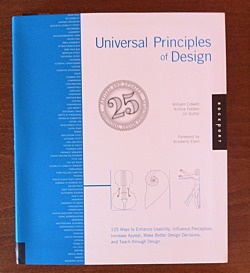
This paragraph — from the brief introduction of the book — tells you much about its content.
It picks and describes 125 universal principles of design. Each on two pages. First page concisely summarizes the principle giving you resources for further reading. The second page holds real-world example of the principle.
Principles are ordered alphabetically. Here is the first ten to give you some feel:
- 80/20 rule
- Accessibility
- Advance Organizer
- Aesthetic-Usability Effect
- Affordance
- Alignment
- Anthropomorphic Form
- Archetypes
- Area alignment
- Attractiveness Bias
In my view Universal Principles of Design accomplishes what the authors set out to do:
Courses in psychology and anthropology were glaringly absent from my undergraduate and graduate design education. Indeed, a deeper understanding of human behavior and a scholarly approach to design were almost entirely overlooked. I left college with considerable knowledge in form making and very little knowledge in understanding human perception and meaning making. Universal Principles of Designis a resource that helps to fill in some of the gaps, dispel myths, and give sound reasons for much of what is felt intuitively, and yet not fully understood.
What I like the most about this book is its mix of conciseness and comprehensiveness. Like a good map, it gives you clear overview of wast area while giving you pointers where to delve deeper.
Warning: Should you buy this book after clicking on the links at this page, I may get some coffee money from Amazon.
Dieter Bohn and Ellis Hamburger writing for The Verge:
When Page took office, his first directive was clear. “Larry said ‘hey everyone, we’re going to redesign all of our products,’” recalls Jon Wiley, lead designer on Google Search. Wiley and co had just two months to give Google a fresh coat of paint, and to start thinking holistically about how Google as a whole was perceived. “We had a mandate to make this all look good,” Wiley says.
I would just add that, as Steve Jobs said:
Design is not just what it looks like and feels like. Design is how it works.
And there is a lot of emphasis on the “looks” of things in the article and video. That said, the new Google Maps on iOS are great, better than Apple’s.
I can still remember some of those early meetings, with 3 or 4 of us in a locked room somewhere on Apple campus, with a lot of whiteboards, talking about what iMovie should be (and should not be). It was as pure as pure gets, in terms of building software. Steve would draw a quick vision on the whiteboard, we’d go work on it for a while, bring it back, find out the ways in which it sucked, and we’d iterate, again and again and again. That’s how it always went. Iteration. It’s the key to design, really. Just keep improving it until you have to ship it.
[…]
One of the things about designing products that can come up is Ego, or Being Right, or whatever that is called. I’m not sure how this evolved, but when I worked with Steve on product design, there was kind of an approach we took, unconsciously, which I characterize in my mind as a “cauldron”. There might be 3 or 4 or even 10 of us in the room, looking at, say, an iteration of iPhoto. Ideas would come forth, suggestions, observations, whatever. We would “throw them into the cauldron”, and stir it, and soon nobody remembered exactly whose ideas were which. This let us make a great soup, a great potion, without worrying about who had what idea. This was critically important, in retrospect, to decouple the CEO from the ideas.
Via @daringfireball
The trend away from skeuomorphic special effects in UI design is the beginning of the retina-resolution design era. Our designs no longer need to accommodate for crude pixels. Glossy/glassy surfaces, heavy-handed transparency, glaring drop shadows, embossed text, textured material surfaces — these hallmarks of modern UI graphic design style are (almost) never used in good print graphic design. They’re unnecessary in print, and, the higher the quality of the output and more heavy-handed the effect, the sillier such techniques look. They’re the aesthetic equivalent of screen-optimized typefaces like Lucida Grande and Verdana. They work on sub-retina displays because sub-retina displays are so crude. On retina displays, as with high quality print output, these techniques are revealed for what they truly are: an assortment of parlor tricks that fool our eyes into thinking we see something that looks good on a display that is technically incapable of rendering graphic design that truly looks good.
…
If you want to see the future of software UI design, look to the history of print design.
I mostly agree, but I would be carefull with relying on the print for guidence to future software UI designs. For one thing, print is not interactive, neither is used to get the job done in the same way software is.
I agree we are at the beginning of the swing in the opposite direction from skeuomorphism and I think we will overdo it, as we always do.
The evolution of design is sort of tacking against the wind.
Article written by Kontra and goes along these lines.
Apple’s software problems aren’t dark linen, Corinthian leather or torn paper. In fact, Apple’s software problems aren’t much about aesthetics at all… they are mostly about experience. To paraphrase Ive’s former boss, Apple’s software problems aren’t about how they look, but how they work.
Via Daring Fireball
Brian Groudan on Mozilla UX blog:
I worked closely with Mozilla user experience researchers and designers to rethink how Firefox can better offer “save for later” in the browser.
Overview of the design process phases follows.
I’ve been thinking more about how I review a design – both my own and someone else’s. So over the past couple days I’ve been writing down every question I’ve been asking when I look at a design-in-progress. Some of these I say out loud, some just go through my head, some are in person, others are posted to Basecamp or Campfire.These are in no particular order, and I don’t ask all of them every time.
Ian Storm Taylor wrote a great piece about not using black (#000000) in your desings.
One of the most important color tricks I’ve ever learned was to avoid using the color black in my work. Mrs. Zamula, my childhood art teacher, first warned me about black when I was in middle school. And I heard the same again multiple times at RISD. It sounds weird at first, but it’s good advice.
Via @daeltar
Google-like search in the library of UI design elements, but wait, with source files such as PSD or HTML/CSS.
Documentary on teaching and design by Inge Druckrey produced by Edward Tufte.
Via @rjs
22 guidelines written by Pixar story artist Emma Coats.
#2: You gotta keep in mind what’s interesting to you as an audience, not what’s fun to do as a writer. They can be v. different.
Nice catch by @rjs and as he said, it applies to product design too. Which is interesting if you think about it. Is product design storytelling in a way? Hmmmm…
Nice overview of how diverse approaches to design can be in different contexts. My favorite is Dieter Rams’ Ten Principles for good design.