Mobile is dead.… Web & apps are both wrong.
— Matias Duarte, Head of Design at Android
I like Matias’ point of view.
Mobile is dead.… Web & apps are both wrong.
— Matias Duarte, Head of Design at Android
I like Matias’ point of view.
Josh Bersin about knowledge workers:
A “Power Law” distribution is also known as a “long tail.” It indicates that people are not “normally distributed.” In this statistical model there are a small number of people who are “hyper high performers,” a a broad swath of people who are “good performers” and a smaller number of people who are “low performers.” It essentially accounts for a much wider variation in performance among the sample.
Via @asymco
Thomas R. Eisenmann answering the question what is entrepreneurship:
[…] entrepreneurship is the pursuit of opportunity beyond resources controlled.
The article goes much deeper, of course.
Buckle up, I’m going all meta on you with this one. But don’t worry, there’s a drawing in there.
I felt, I have a grasp on the concept of how Intelligence differs from Knowledge and Wisdom. When I tried to put it into words, I probably failed. But just now, a picture came to my mind. I suspect my long hours with an unnamed turn based strategy have something to do with it, nonetheless, this metaphor came to me:
Intelligence is our army of soldiers and weaponry we use to conquer Knowledge. Knowledge is the piece of land we control. The dots on an infinite map. With enough Knowledge in our possession, Wisdom emerges. Wisdom is the ability to see connections among the dots of Knowledge and (besides other benefits) shows us new land to conquer.
You see, this is not war for a finite resource that we steal from someone else. Knowledge is boundless as is the Wisdom it produces. And our growth of Knowledge and Wisdom will have positive impact on our Intelligence in the next turn.

It is a self-propelling mechanism. Not all self-propelling mechanisms are necessary good, but this one is a product of Evolution. We may be the branch that fails but who says She plays with just our planet. The Lady will get it right somewhere.
Robert Hoekman writes for Smashing Magazine:
Following is my list of 13 beliefs on the value of user experience strategy, design, and designers, one for every year I’d been in the web industry at the time I wrote it in 2012:Tenet 1:
“User experience is the net sum of every interaction a person has with a company, be it marketing collateral, a customer service call, or the product or service itself. It is affected by the company’s vision and the beliefs it holds and its practices, as well as the service or product’s purpose and the value it holds in a person’s life.”
Read it. I identify myself with all 13 of them.
Robert is the author of Designing the Obvious which is worth a read too.
Via @sixrevisions
Researchers have identified over 18 visual cues wired into our brains and the list keeps growing. These cues range from the orientation of lines, thickness of lines and blinking, to the density of visual objects to motion, velocity and so on. The cues are illustrated below.
We must abandon invisibility as a goal for interfaces; it’s misleading, unhelpful and ultimately dishonest. It unleashes so much potential for unusable, harmful and frustrating interfaces, and systems that gradually erode users and designers agency. Invisibility might seem an attractive concept at first glance, but it ignores the real, thorny, difficult issues of designing and using complex interfaces and systems.
I should read this, maybe you want too.
Not long ago, designers were eclectic generalists. They studied art, science, and religion in order to understand the basic workings of nature, and then applied what they learned to solve the problems of the day. Over time, the quantity and complexity of accumulated knowledge led to increased specialization among designers, and breadth of knowledge was increasingly traded for depth of knowledge. This trend continues today. As designers become more specialized, awareness of advances and discoveries in other areas of specialization diminishes. This is inevitable and unfortunate, since much can be learned from progress in other design disciplines.
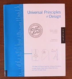
This paragraph — from the brief introduction of the book — tells you much about its content.
It picks and describes 125 universal principles of design. Each on two pages. First page concisely summarizes the principle giving you resources for further reading. The second page holds real-world example of the principle.
Principles are ordered alphabetically. Here is the first ten to give you some feel:
In my view Universal Principles of Design accomplishes what the authors set out to do:
Courses in psychology and anthropology were glaringly absent from my undergraduate and graduate design education. Indeed, a deeper understanding of human behavior and a scholarly approach to design were almost entirely overlooked. I left college with considerable knowledge in form making and very little knowledge in understanding human perception and meaning making. Universal Principles of Designis a resource that helps to fill in some of the gaps, dispel myths, and give sound reasons for much of what is felt intuitively, and yet not fully understood.
What I like the most about this book is its mix of conciseness and comprehensiveness. Like a good map, it gives you clear overview of wast area while giving you pointers where to delve deeper.
Warning: Should you buy this book after clicking on the links at this page, I may get some coffee money from Amazon.
The trend away from skeuomorphic special effects in UI design is the beginning of the retina-resolution design era. Our designs no longer need to accommodate for crude pixels. Glossy/glassy surfaces, heavy-handed transparency, glaring drop shadows, embossed text, textured material surfaces — these hallmarks of modern UI graphic design style are (almost) never used in good print graphic design. They’re unnecessary in print, and, the higher the quality of the output and more heavy-handed the effect, the sillier such techniques look. They’re the aesthetic equivalent of screen-optimized typefaces like Lucida Grande and Verdana. They work on sub-retina displays because sub-retina displays are so crude. On retina displays, as with high quality print output, these techniques are revealed for what they truly are: an assortment of parlor tricks that fool our eyes into thinking we see something that looks good on a display that is technically incapable of rendering graphic design that truly looks good.
…
If you want to see the future of software UI design, look to the history of print design.
I mostly agree, but I would be carefull with relying on the print for guidence to future software UI designs. For one thing, print is not interactive, neither is used to get the job done in the same way software is.
I agree we are at the beginning of the swing in the opposite direction from skeuomorphism and I think we will overdo it, as we always do.
The evolution of design is sort of tacking against the wind.
I’ve noticed this question on Quora.
And there’s an answer in a form of a quote from Ira Glass which just hits home for me:
Nobody tells this to people who are beginners, I wish someone told me. All of us who do creative work, we get into it because we have good taste. But there is this gap. For the first couple years you make stuff, it’s just not that good. It’s trying to be good, it has potential, but it’s not.
But your taste, the thing that got you into the game, is still killer. And your taste is why your work disappoints you.
A lot of people never get past this phase, they quit. Most people I know who do interesting, creative work went through years of this. We know our work doesn’t have this special thing that we want it to have. We all go through this.
And if you are just starting out or you are still in this phase, you gotta know its normal and the most important thing you can do is do a lot of work. Put yourself on a deadline so that every week you will finish one story. It is only by going through a volume of work that you will close that gap, and your work will be as good as your ambitions.
And I took longer to figure out how to do this than anyone I’ve ever met. It’s gonna take awhile. It’s normal to take awhile. You’ve just gotta fight your way through.
(Speaking of Ira Glass, you do listen to This American Life, right?)
For me it stands right beside another big one by Steve Jobs:
When you grow up you tend to get told that the world is the way it is and your life is just to live your life inside the world. Try not to bash into the walls too much. Try to have a nice family, have fun, save a little money.That’s a very limited life. Life can be much broader once you discover one simple fact: Everything around you that you call life was made up by people that were no smarter than you and you can change it, you can influence it, you can build your own things that other people can use.
Once you learn that, you’ll never be the same again.
I’ve been thinking more about how I review a design – both my own and someone else’s. So over the past couple days I’ve been writing down every question I’ve been asking when I look at a design-in-progress. Some of these I say out loud, some just go through my head, some are in person, others are posted to Basecamp or Campfire.These are in no particular order, and I don’t ask all of them every time.
List of 20 well articulated points by Joshua Porter.
Ian Storm Taylor wrote a great piece about not using black (#000000) in your desings.
One of the most important color tricks I’ve ever learned was to avoid using the color black in my work. Mrs. Zamula, my childhood art teacher, first warned me about black when I was in middle school. And I heard the same again multiple times at RISD. It sounds weird at first, but it’s good advice.
Via @daeltar
Documentary on teaching and design by Inge Druckrey produced by Edward Tufte.
Via @rjs
This article should give you quick overview of Clayton Christensen’s ground breaking book Innovator’s Solution and then I will try to apply his point onto the web application industry.
Citing from the book:
Disruptive innovations … don’t attempt to bring better products to established customers in existing markets. Rather, they disrupt and redefine that trajectory by introducing products and services that are not as good as currently available products. But disruptive technologies offer other benefits–typically, they are simpler, more convenient, and less expensive products that appeal to new or less-demanding customers.
…Disruption has a paralyzing effect on industry leaders. With resource allocation processes designed and perfected to support sustaining innovations, they are constitutionally unable to respond. They are always motivated to go up-market, and almost never motivated to defend the new or low-end markets that the disruptors find attractive. We call this phenomenon asymmetric motivation.
You should definitely take a look at Innovator’s Solution, it’s great book and has more interesting concepts in it like the cycle between integration and modularization in an industry or the job to be done approach to business strategy.
I will introduce you to two key concepts of the book – low-end and new-market disruption.
Low-end disruption, as described by Clayton, starts at the low end of the existing market. But the lower price is a result of new business processes not just lower margin on the same process employed by established market players.
One example of this strategy may be Walmart and other discount stores that offer their customers cheaper goods but compensate the lower margin via much larger amount of sold inventory and quicker turnover of inventory. So they may have lower margins than traditional stores, but they turn it over three times faster thereby more than making up for it. And then there are all the elaborate logistic things Walmart does, going so far as to direct their suppliers businesses in some ways.
Another example may be personal computers, which were low-end disruption relative to the mainframes. Or now the tablets (iPad) which are disrupting the PC.
The key is that there are overserved customers in the existing markets that are willing to let go of some features of the product in exchange for lower price, simplicity, convenience etc.
Established players are motivated not to fight with the new entrant as he is attacking the least earning portion of their business.
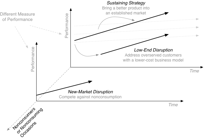
The target group of new-market disruption are non-consumers or non-consuming occasions. The disruptor is somehow able to transform existing product and get the new consumers.
Example might be the first transistor radios that were too low quality for the existing customers but were great for teenagers who were able to listen to what they wanted for the first time. And they allow everyone to listen on the go or outside home, which was impossible before.
The best thing from the point of view of the disruptor is that established market players ignore you for a long time because you are not eating their lunch. At least not for some time. And then it is too late for them.
OK, this was really quick and simplifying intro, again, read the book and/or watch the videos linked bellow.
In part 2, I will look at the implication of all this on the market of web applications.
Good article by Patrick Cox of Codrops, about these elements of pricing page:
22 guidelines written by Pixar story artist Emma Coats.
#2: You gotta keep in mind what’s interesting to you as an audience, not what’s fun to do as a writer. They can be v. different.
Nice catch by @rjs and as he said, it applies to product design too. Which is interesting if you think about it. Is product design storytelling in a way? Hmmmm…
Nice overview of how diverse approaches to design can be in different contexts. My favorite is Dieter Rams’ Ten Principles for good design.